Beta SDK
Learn about general User Feedback configuration fields for version 7 of the JavaScript SDK.
Deprecation Warning
In version 7 of our JavaScript SDK, User Feedback was released as a Beta integration. We recommend updating your SDK to version 8.
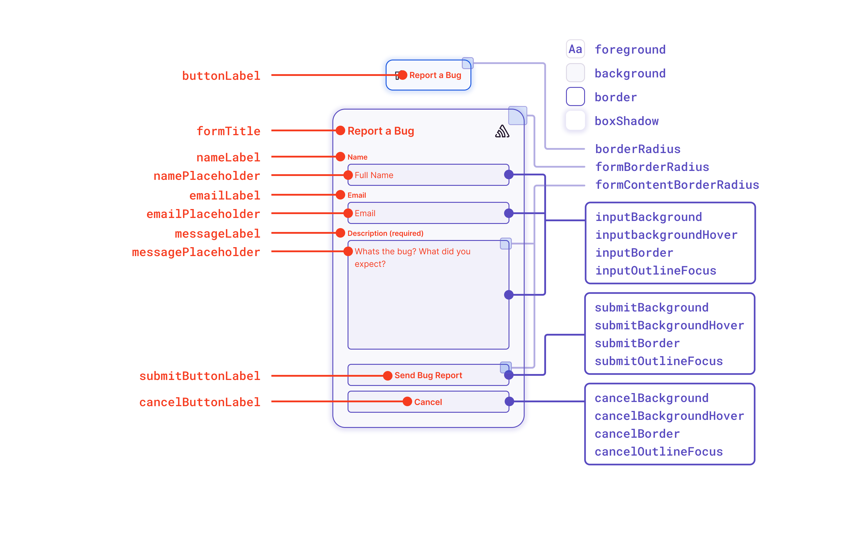
The User Feedback Widget offers many customization options, and if the available options are insufficient, you can use your own UI. The following image shows which elements are customizable. The configuration keys on the left of the image correspond to text customization, while the ones on the right side are for theme customizations.
The following options can be configured for the integration in feedbackIntegration({}):
| Key | Type | Default | Description |
|---|---|---|---|
autoInject | boolean | true | Injects the Feedback widget into the application when the integration is added. Set autoInject: false if you want to call feedback.attachTo() or feedback.openDialog() directly, or only want to show the widget on certain views. |
showBranding | boolean | true | Displays the Sentry logo inside of the form |
colorScheme | "system" | "light" | "dark" | "system" | Shows the color theme choices. "system" will use your OS color scheme. |
| Key | Type | Default | Description |
|---|---|---|---|
showName | boolean | true | Displays the name field on the feedback form. |
showEmail | boolean | true | Displays the email field on the feedback form. |
isNameRequired | boolean | false | Requires the name field on the feedback form to be filled in. |
isEmailRequired | boolean | false | Requires the email field on the feedback form to be filled in. |
useSentryUser | Record<string, string> | { email: 'email', name: 'username'} | Sets the email and name fields to the corresponding Sentry SDK user fields that were called with Sentry.setUser. |
By default, the Feedback integration will attempt to fill in the name and email fields if you've set a user context via Sentry.setUser(). The email and name fields are expected to be email and username. Below is an example configuration with non-default user fields:
Sentry.setUser({
  email: 'foo@example.com',
  fullName: 'Jane Doe',
});

feedbackIntegration({
  useSentryUser: {
    email: 'email',
    name: 'fullName',
  },
});
Most text that you see in the default Feedback widget can be customized.
| Key | Default | Description |
|---|---|---|
buttonLabel | Report a Bug | The label of the injected button. |
submitButtonLabel | Send Bug Report | The label of the submit button used in the feedback form. |
cancelButtonLabel | Cancel | The label of the cancel button used in the feedback form. |
formTitle | Report a Bug | The title at the top of the feedback form. |
nameLabel | Name | The label of the name input field. |
namePlaceholder | Your Name | The placeholder for the name input field. |
emailLabel | Email | The label of the email input field. |
emailPlaceholder | your.email@example.org | The placeholder for the email input field. |
messageLabel | Description | The label for the feedback description input field. |
messagePlaceholder | What's the bug? What did you expect? | The placeholder for the feedback description input field. |
successMessageText | Thank you for your report! | The message to be displayed after a succesful feedback submission. |
isRequiredText | (required) | The text displayed next to a required field. |
Example of customization:
feedbackIntegration({
  buttonLabel: 'Feedback',
  submitButtonLabel: 'Send Feedback',
  formTitle: 'Send Feedback',
});
Colors can be customized via the Feedback class constructor or by defining CSS variables on the injected button. If you use the default button it will have a property id="sentry-feedback, meaning you can use the #sentry-feedback selector to define CSS variables to override.
| Key | CSS Variable | Light | Dark | Description |
|---|---|---|---|---|
background | --background | #ffffff | #29232f | Background color of the widget (injected button and form). |
backgroundHover | --background-hover | #f6f6f7 | #352f3b | Background color of the injected button when in a hover state. |
foreground | --foreground | #2b2233 | #ebe6ef | Foreground color, e.g. text color. |
error | --error | #df3338 | #f55459 | Color used for error related components (e.g. text color when there was an error submitting feedback). |
success | --success | #268d75 | #2da98c | Color used for success-related components (e.g. text color when feedback is submitted successfully). |
border | --border | 1.5px solid rgba(41, 35, 47, 0.13) | 1.5px solid rgba(235, 230, 239, 0.15) | The border style used for the widget (injected button and form). |
borderRadius | --border-radius | 12px | 12px | Border radius style used for the widget (injected button and success message). |
boxShadow | --box-shadow | 0px 4px 24px 0px rgba(43, 34, 51, 0.12) | 0px 4px 24px 0px rgba(43, 34, 51, 0.12) | The box shadow style used for the widget (injected button and form). |
submitBackground | --submit-background | rgba(88, 74, 192, 1) | rgba(88, 74, 192, 1) | Background color for the submit button. |
submitBackgroundHover | --submit-background-hover | rgba(108, 95, 199, 1) | rgba(108, 95, 199, 1) | Background color when hovering over the submit button. |
submitBorder | --submit-border | rgba(108, 95, 199, 1) | rgba(108, 95, 199, 1) | Border style for the submit button. |
submitOutlineFocus | --submit-outline-focus | rgba(108, 95, 199, 1) | rgba(108, 95, 199, 1) | Outline color for the submit button, in the focused state. |
submitForeground | --submit-foreground | #ffffff | #ffffff | Foreground color for the submit button. |
submitForegroundHover | --submit-foreground-hover | #ffffff | #ffffff | Foreground color for the submit button when hovering. |
cancelBackground | --cancel-background | transparent | transparent | Background color for the cancel button. |
cancelBackgroundHover | --cancel-background-hover | var(--background-hover) | var(--background-hover) | Background color when hovering over the cancel button. |
cancelBorder | --cancel-border | var(--border) | var(--border) | Border style for the cancel button. |
cancelOutlineFocus | --cancel-outline-focus | var(--input-outline-focus) | var(--input-outline-focus) | Outline color for the cancel button, in the focused state. |
cancelForeground | --cancel-foreground | var(--foreground) | var(--foreground) | Foreground color for the cancel button. |
cancelForegroundHover | --cancel-foreground-hover | var(--foreground) | var(--foreground) | Foreground color for the cancel button when hovering. |
inputBackground | --input-background | inherit | inherit | Background color for form inputs. |
inputForeground | --input-foreground | inherit | inherit | Foreground color for form inputs. |
inputBorder | --input-border | var(--border) | var(--border) | Border styles for form inputs. |
inputOutlineFocus | --input-outline-focus | rgba(108, 95, 199, 1) | rgba(108, 95, 199, 1) | Outline color for form inputs when focused. |
formBorderRadius | --form-border-radius | 20px | 20px | Border radius style for the form. |
formContentBorderRadius | --form-content-border-radius | 6px | 6px | Border radius style for form content (for example: inputs, buttons). |
Here is an example of customizing only the background color for the light theme using the Feedback constructor configuration:
feedbackIntegration({
  themeLight: {
    background: '#cccccc',
  },
});
Or the same example as above, but using the CSS variables method instead:
#sentry-feedback {
  --background: #cccccc;
}
These are additional CSS variables that can be overridden, similar to the theme customization above. They're not supported in the constructor.
| Variable | Default | Description |
|---|---|---|
--bottom | 1rem | By default, the widget has a position of fixed, and is in the bottom right corner. |
--right | 1rem | By default, the widget has a position of fixed, and is in the bottom right corner. |
--top | auto | By default, the widget has a position of fixed, and is in the bottom right corner. |
--left | auto | By default, the widget has a position of fixed, and is in the bottom right corner. |
--z-index | 100000 | The z-index of the widget. |
--font-family | "'Helvetica Neue', Arial, sans-serif" | Default font-family to use. |
--font-size | 14px | Font size. |
Because it’s sometimes useful to know when a user started interacting with the feedback form, we've made it possible for you to add custom logging, or start and stop background timers on the page that tell you when the user is done.
Pass these callbacks when you initialize the Feedback integration:
feedbackIntegration({
  onFormOpen: () => {},
  onFormClose: () => {},
  onSubmitSuccess: () => {},
  onSubmitError: () => {},
});
You can use your own button instead of the default injected button to trigger the form being displayed, by calling feedback.attachTo() to have the SDK attach a click listener to your button. You can also supply the same customization options that the constructor accepts (for example, for text labels and colors).
const feedback = feedbackIntegration({
  // Disable injecting the default widget
  autoInject: false,
});

feedback.attachTo(document.querySelector('#your-button'), {
  formTitle: 'Report a Bug!',
});
Alternatively, you can call feedback.openDialog():
import {BrowserClient, Feedback, getClient} from '@sentry/react';

function MyFeedbackButton() {
  const client = getClient<BrowserClient>();
  const feedback = client?.getIntegration(Feedback);

  // Don't render custom feedback button if Feedback integration isn't installed
  if (!feedback) {
    return null;
  }

  return (
    <button type="button" onClick={() => feedback.openDialog()}>
      Give me feedback
    </button>
  );
}
You can also use your own UI components to gather feedback and pass the feedback data object to the sendFeedback() function. The sendFeedback function accepts two parameters:
- A JavaScript object with a required
messageproperty and also optionalnameandemailproperties, or aFormDatainstance with the same properties. - An optional "options" object.
Sentry.sendFeedback(
  {
    name: 'Jane Doe', // optional
    email: 'email@example.org', // optional
    message: 'This is an example feedback', // required
  },
  {
    includeReplay: true, // optional
  }
);
Here's a simple example:
<form id="my-feedback-form">
  <input name="name" />
  <input name="email" />
  <textarea name="message" placeholder="What's the issue?" />
</form>
You can customize the Crash-Report modal to your organization's needs, for example, for localization purposes. All options can be passed through the Sentry.showReportDialog call.
| Param | Default |
|---|---|
eventId | Manually set the id of the event. |
dsn | Manually set dsn to report to. |
user | Manually set user data [an object with keys listed below]. |
user.email | User's email address. |
user.name | User's name. |
lang | [automatic] – (Override for Sentry’s language code.) |
title | It looks like we’re having issues. |
subtitle | Our team has been notified. |
subtitle2 | If you’d like to help, tell us what happened below. – (Not visible on small screen resolutions.) |
labelName | Name |
labelEmail | |
labelComments | What happened? |
labelClose | Close |
labelSubmit | Submit |
errorGeneric | An unknown error occurred while submitting your report. Please try again. |
errorFormEntry | Some fields were invalid. Please correct the errors and try again. |
successMessage | Your feedback has been sent. Thank you! |
onLoad | n/a - (An optional callback that will be invoked when the widget opens.) |
onClose | n/a - (An optional callback that will be invoked when the widget closes.) |
The optional callback onLoad will be called when users see the widget. You can use this to run custom logic, for example to log an analytics event:
Sentry.showReportDialog({
  // ...
  onLoad() {
    // Log an event to amplitude when the report dialog opens
    amplitude.logEvent('report_dialog_seen');
  },
});
The optional callback onClose will be called when users close the widget. You can use this to run custom logic, for example to reload the page:
Requires JS SDK version v7.82.0 or higher.
Sentry.showReportDialog({
  // ...
  onClose() {
    // Refresh the page after the user closes the report dialog
    location.reload();
  },
});
Our documentation is open source and available on GitHub. Your contributions are welcome, whether fixing a typo (drat!) or suggesting an update ("yeah, this would be better").